Testing page
Estimated reading time: 26 minutesWelcome to the Docker documentation test page!
This is a demo of components, tags, styles, tools, and strategies we use for the
docs. We explain the code behind the published page and demo the effects. So, if
you want to see, for example, how admonitions and notes are coded in markdown,
read the section on Admonitions (notes) on the web
published page and study the pre-processed test.md to see how they are
implemented. The Docker documentation team uses this page as “note to self”
reminders. Since we invite docs suggestions and contributions from the
community, we’ve always made the test page generally available.
If you want to understand how something in the docs is coded, use this page is as a resource.
If, in the course of making docs updates and suggestions, you develop a new strategy or component for the docs, feel free to add a demo and explanation to this test page and submit a PR for it so we can review and discuss it.
Cool? Let’s dive in!
Heading 1
Most pages don’t actually have a H1 heading. The page title from the metadata is
automatically inserted. We have included it here to show all heading levels, and
set front matter as toc_min: 1 so that it shows in the navigation bar (on-page
topics).
Heading 2
By default, this is the highest heading included in the right navigation bar. To
include more heading levels, set toc_min: 1 in the page’s front-matter (as is
done on this test.md page). You can go all the way to 6, but if toc_min is
geater than toc_max then no headings are shown.
Heading 3
This is the lowest heading included in the right-nav, by default. To include
more heading levels, set toc_max: 4 in the page’s front-matter. You can go all
the way to 6.
Heading 4
This heading is not included in the right-nav. To include it set toc_max: 4 in
the page’s front-matter.
Heading 5
This heading is not included in the right-nav. To include it set toc_max: 5 in
the page’s front-matter.
Heading 6
This is probably too many headings. Try to avoid it.
This heading is not included in the right-nav. To include it set toc_max: 6 in
the page’s front-matter.
Typography
Plain block of text.
Lorem ipsum dolor sit amet, consectetur adipisicing elit, sed do eiusmod tempor incididunt ut labore et dolore magna aliqua. Ut enim ad minim veniam, quis nostrud exercitation ullamco laboris nisi ut aliquip ex ea commodo consequat. Duis aute irure dolor in reprehenderit in voluptate velit esse cillum dolore eu fugiat nulla pariatur. Excepteur sint occaecat cupidatat non proident, sunt in culpa qui officia deserunt mollit anim id est laborum.
Inline text styles:
- bold
- italic
- bold italic
strikethrough- underline
- underline italic
- underline bold
- underline bold italic
monospace textmonospace bold
Links and images
Links
- a markdown link https://github.com/docker/docker.github.io/tree/master/docker-cloud/images
-
a markdown link that opens in a new window (the
class="_"trick prevents Atom from italicizing the whole rest of the file until it encounters another underscore.) -
A link to a Github PR in
docker/docker: #28199 -
A link to a Github PR in
docker/docker.github.io: #9999- You can specify
org=footo use a Github organization other than Docker
- You can specify
-
A link to an auto-generated reference page that we pull in during docs builds: /engine/reference/builder/#env.
-
If you can’t find a reference page in the
docker.github.ioGitHub repository, but see it out ondocs.docker.com, you can surmise that it’s probably auto-generated from the codebase. (FYI, to view the markdown source for the file, just click Edit this page ondocs.docker.com. But don’t use that URL in your docs.) -
Go to the file in a web browser, grab everything after the domain name from the URL, and use that as the link in your docs file.
-
Keep in mind that this link doesn’t resolve until you merge the PR and your docs are published on docs.docker.com.
-
Using a custom target ID
This topic has a custom target ID above its heading that can be used to link to
it, in addition to, or instead of, the default concatenated heading style. The
format of this ID is {: id="custom-target-id"}.
You can use custom targets to link to headings or even paragraphs. You link to
it as you would any other link, using #custom-target-id as the ultimate
target.
An example of a custom target ID in the documentation is the topic on Compose file version 2 topic on CPU and other resources. It has a long heading that breaks the normal markdown linking mechanism, so we added a custom ID above the target heading.
Images
-
A small cute image:

-
A small cute image that is a link. The extra newline here makes it not show inline:
-
A big wide image:

-
The same as above but using HTML:
Some Bootstrap image classes might be interesting. You can use them with Markdown or HTML images.
-
An image using the Bootstrap “thumbnail” class:
-
The same one, but using HTML:
Videos
You can add a link to a YouTube video like this:
Docker 101: Introduction to Docker
To make the .png shown above, first take a screen snap of the YouTube video
you want to use, then use a graphics app to overlay a play button onto the
image.
For the overlay, you can use the play button at /docker-cloud/images/.
Lists
- Bullet list item 1
- Bullet list item 2
- Bullet list item 3
-
Numbered list item 1. Two spaces between the period and the first letter helps with alignment.
-
Numbered list item 2. Let’s put a note in it.
Note: We did it!
-
Numbered list item 3 with a code block in it. You need the blank line before the code block happens.
$ docker run hello-world -
Numbered list item 4 with a bullet list inside it and a numbered list inside that.
- Sub-item 1
- Sub-item 2
- Sub-sub-item 1
-
Sub-sub-item-2 with a table inside it because we like to party! Indentation is super important.
Header 1 Header 2 Thing 1 Thing 2 Thing 3 Thing 4
Tables
Some tables in markdown and html.
| Permission level | Access |
|---|---|
| Bold or italic within a table cell. Next cell is empty on purpose. | |
Previous cell is empty. A --flag in mono text. |
|
| Read | Pull |
| Read/Write | Pull, push |
| Admin | All of the above, plus update description, create and delete |
The alignment of the cells in the source doesn’t really matter. The ending pipe character is optional (unless the last cell is supposed to be empty). The header row and separator row are optional.
If you need block-level HTML within your table cells, such as multiple
paragraphs, lists, sub-tables, etc, then you need to make a HTML table.
This is also the case if you need to use rowspans or colspans. Try to avoid
setting styles directly on your tables! If you set the width on a <td>, you
only need to do it on the first one. If you have a <th>, set it there.
Note: If you need to have markdown in a HTML table, add
markdown="span"to the HTML for the<td>cells that contain the Markdown.
| Left channel | Right channel |
|---|---|
| This is some test text. This is more text on a new line. Lorem ipsum dolor sit amet, consectetur adipisicing elit, sed do eiusmod tempor incididunt ut labore et dolore magna aliqua. |
This is some more text about the right hand side. There is a link here to the Docker Experimental Features README on GitHub. In tables, links need to be ``. Lorem ipsum dolor sit amet, consectetur adipisicing elit, sed do eiusmod tempor incididunt ut labore et dolore magna aliqua. |
Glossary links and content
The glossary source lives in the documentation repository
docker.github.io in
_data/glossary.yaml. The glossary publishes to
https://docs.docker.com/glossary/.
To update glossary content, edit _data/glossary.yaml.
To link to a glossary term, link to glossary.md#YourGlossaryTerm (for
example, swarm).
Site-wide variables
Look in the top-level _config.yml for site-wide variables, such as
site.docker_ce_version. To use them, use Liquid like:
{{ site.docker_ce_version }}
The current value of site.docker_ce_version is
19.03.
Mixing Markdown and HTML
You can use span-level HTML tags within Markdown.
You can use a <br /> tag to impose an extra newline like here:
You can use entities like to keep a bunch of words together .
Keep reading for more examples, such as creating tabbed content within the page or displaying content as “cards”.
Jekyll / Liquid tricks
Assignment
This paragraph is centered and colored green by setting CSS directly on the element. Even though you can do this and it’s sometimes the right way to go, remember that if we re-skin the site, any inline styles need to be dealt with manually!
The Liquid assignment just before this line fills in the following token foo. This is effective for the rest of this file unless the token is reset.
Here is another way: foo
You can nest captures within each other to represent more complex logic with Liquid.
Liquid variable scope
- Things set in the top level of
_config.ymlare available as site variables, like ``. - Things set in the page’s metadata, either via the defaults in
_config.ymlor per page, are available as page variables, likeTesting page. - In-line variables set via
assignorcaptureare available for the remainder of the page after they are set. - If you include a file, you can pass key-value pairs at the same time. These are available as include variables, like ``.
Image formatting
This image was originally created on a white background and converted to a transparent background (or so it seems). In night-mode, the text still shows traces of the white and looks garbled. To fix this, we apply a white background inline with a class defined in _scss/_night-mode.css (and incorporated into style.css): img.white-bg { background-color: white; }.
Bootstrap and CSS tricks
Here are cool components you can include on Docs pages using Bootstrap and CSS.
Tabs
Here are some tabs:
You need to adjust the id and data-target values to match your use case.
The <hr>’s are included simply to add visual separation between tabbed content
and the other topics on the page.
If you have Markdown inside the content of the <div>, just add markdown="1"
as an attribute in the HTML for the <div> so that Kramdown renders it.
A Markdown header
- list item 1
- list item 2
Another Markdown header
- list item 3
- list item 4
Synchronizing multiple tab groups
Consider an example where you have something like one tab per language, and
you have multiple tab sets like this on a page. You might want them to all
toggle together. We have Javascript that loads on every page that lets you
do this by setting the data-group attributes to be the same. The
data-target attributes still need to point to unique div IDs.
In this example, selecting Go or Python in one tab set toggles the
other tab set to match.
And some content between the two sets, just for fun...
Cards
In a Bootstrap row, your columns need to add up to 12. Here are three cards in
a row, each of which takes up 1/3 (4/12) of the row. You need a couple <br />s
to clear the row before.
Expand/Collapse accordions
You can use the Bootstrap and CSS to add expand/collapse accordions. This
implementation makes use of the .panel-heading classes in
_utilities.scss, along with FontAwesome
icons
(fa-caret-down) and
(fa-caret-up).
Adding block to the div class collapse gives you some padding around the
sample content. This works nicely for standard text. If you have a code sample,
the padding renders as white space around the code block grey background. If we
don’t like this effect, we can remove block for code samples.
The style="cursor: pointer" tag enables the expand/collapse functionality to
work on mobile. (You can use the Xcode iPhone simulator to test on mobile.)
There are a lot of samples out there for Bootstrap accordions. This is the model we used: PPxOJX accordion sample with HTML and CSS. (Here is another example, but it uses Javascript, whereas the implementation shown here is Bootstrap and CSS only.)
Make sure
data-target’s andid’s match, and are uniqueFor each drop-down, the value for
data-targetandcollapseidmust match, and id’s must be unique per page. In this example, we name thesecollapseSample1andcollapseSample2. Check out the Compose file structure example to see another example.
$ docker run hello-world
Unable to find image 'hello-world:latest' locally
latest: Pulling from library/hello-world
b04784fba78d: Pull complete
Digest: sha256:f3b3b28a45160805bb16542c9531888519430e9e6d6ffc09d72261b0d26ff74f
Status: Downloaded newer image for hello-world:latest

Hello from Docker!
This message shows that your installation appears to be working correctly.

To generate this message, Docker took the following steps:
 1. The Docker client contacted the Docker daemon.
 2. The Docker daemon pulled the "hello-world" image from the Docker Hub.
 3. The Docker daemon created a new container from that image which runs the
    executable that produces the output you are currently reading.
 4. The Docker daemon streamed that output to the Docker client, which sent it
    to your terminal.

To try something more ambitious, you can run an Ubuntu container with:
 $ docker run -it ubuntu bash

Share images, automate workflows, and more with a free Docker ID:
 https://hub.docker.com/

For more examples and ideas, visit:
 https://docs.docker.com/engine/userguide/
Lorem ipsum dolor sit amet, consectetur adipiscing elit, sed do eiusmod tempor incididunt ut labore et dolore magna aliqua. Ut enim ad minim veniam, quis nostrud exercitation ullamco laboris nisi ut aliquip ex ea commodo consequat. Duis aute irure dolor in reprehenderit in voluptate velit esse cillum dolore eu fugiat nulla pariatur. Excepteur sint occaecat cupidatat non proident, sunt in culpa qui officia deserunt mollit anim id est laborum.
Columnar text
You can use the CSS column-count to flow your text into multiple columns.
You need a couple <br />s to clear the row before.
This example does it with Markdown. You can’t have any blank lines or it breaks the Markdown block up. This example does it with Markdown. You can’t have any blank lines or it breaks the Markdown block up. This example does it with Markdown. You can’t have any blank lines or it breaks the Markdown block up. This example does it with Markdown. You can’t have any blank lines or it breaks the Markdown block up. This example does it with Markdown. You can’t have any blank lines or it breaks the Markdown block up. This example does it with Markdown. You can’t have any blank lines or it breaks the Markdown block up. This example does it with Markdown. You can’t have any blank lines or it breaks the Markdown block up.
Badges
You can have badges. You can also have yellow badges or red badges.
Badges as links
You can make a badge a link. Wrap the <span> with an <a> (not the other way
around) so that the text on the badge is still white.
<a href="/test/" target="_blank" class="_"><span class="badge badge-info" data-toggle="tooltip" data-placement="right" title="Open the test page (in a new window)">Test</span></a>
You can also put tooltips on badges (as the example above shows). Keep reading for tooltips.
Tooltips
To add a tooltip to any element, set data-toggle="tooltip" and set a title.
Hovering over the element with the mouse pointer will make it visible. Tooltips
are not visible on mobile devices or touchscreens, so don’t rely on them as the
only way to communicate important info.
<span class="badge badge-info" data-toggle="tooltip" data-placement="right" title="Open the test page">Test</span>
Test
You can optionally set the data-placement attribute to top, bottom,
middle, center, left, or right. Only set it if not setting it causes
layout issues.
You don’t have to use HTML. You can also set these attributes using Markdown.
This is a paragraph that has a tooltip. We position it to the left so it doesn't align with the middle top of the paragraph (that looks weird).
{:data-toggle="tooltip" data-placement="left" title="Markdown tooltip example"}
This is a paragraph that has a tooltip. We position it to the left so it doesn’t align with the middle top of the paragraph (that looks weird).
Running in-page Javascript
If you need to run custom Javascript within a page, and it depends upon JQuery
or Bootstrap, make sure the <script> tags are at the very end of the page,
after all the content. Otherwise the script may try to run before JQuery and
Bootstrap JS are loaded.
Note: In general, this is a bad idea.
Admonitions (notes)
Current styles for admonitions in
_scss/_notes.scss
support these broad categories of admonitions:
- Notes (no Liquid tag required) (deprecated)
- Important, which use the
{: .important}tag - Warning , which use the
{: .warning}tag
The new styles include prepended icons, color sidebars, and bold color titles for multi-paragraph notes, but no auto-prepended text. These are defined in a way that does not impact admonitions formatted with the original styles, so notes in your published documents are not adversely affected.
Examples are shown in the following sections.
Note (Deprecated)
Notes are deprecated and should not longer be used. Use important or warning instead.
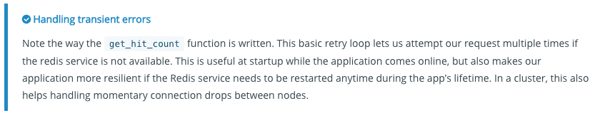
A standard note is formatted like this:
> Handling transient errors
>
> Note the way the `get_hit_count` function is written. This basic retry
> loop lets us attempt our request multiple times if the redis service is
> not available. This is useful at startup while the application comes
> online, but also makes our application more resilient if the Redis
> service needs to be restarted anytime during the app's lifetime. In a
> cluster, this also helps handling momentary connection drops between
> nodes.
It renders like this with a colored sidebar and icon:
Notes were previously formatted like this:
> **Note**: This is a note using the old note style.
These will still render as a note with a colored sidebar to the left but no icon will be added.
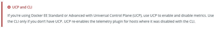
Important
Add the important class to your blockquotes if you want to tell users to be careful about something:
> Pssst, wanna know something?
>
> You include a small description here telling users to be on the lookout
{: .important}
It renders like this with a colored sidebar and icon:

Warning
Use the warning class to let people know this is dangerous or they should pay close attention to this part of the road before moving on:
> Ouch, don't do that!
>
> Sticking your finger in an electrical outlet can result in an electric shock.
>
> You can also add more paragraphs here if your explanation is super complex.
{: .warning}
It will render like this with a colored sidebar and icon:
Code blocks
Rouge provides lots of different code block “hints”. If you leave off the hint, it tries to guess and sometimes gets it wrong. These are just a few hints that we use often.
Raw, no highlighting
The raw markup is needed to keep Liquid from interpreting the things with double braces as templating language.
none with raw
$ some command with {{double braces}}
$ some other command
Raw, Bash
bash with raw
$ some command with {{double braces}}
$ some other command
Bash
$ echo "deb https://packages.docker.com/1.12/apt/repo ubuntu-trusty main" | sudo tee /etc/apt/sources.list.d/docker.list
Go
incoming := map[string]interface{}{
    "asdf": 1,
    "qwer": []interface{}{},
    "zxcv": []interface{}{
        map[string]interface{}{},
        true,
        int(1e9),
        "tyui",
    },
}
PowerShell
Install-Module DockerMsftProvider -Force
Install-Package Docker -ProviderName DockerMsftProvider -Force
[System.Environment]::SetEnvironmentVariable("DOCKER_FIPS", "1", "Machine")
Expand-Archive docker-18.09.1.zip -DestinationPath $Env:ProgramFiles -Force
Python
return html.format(name=os.getenv('NAME', "world"), hostname=socket.gethostname(), visits=visits)
Ruby
docker_service 'default' do
  action [:create, :start]
end
JSON
Warning: Syntax highlighting breaks easily for JSON if the code you present is not a valid JSON document. Try running your snippet through this linter to make sure it’s valid, and remember: there is no syntax for comments in JSON!
"server": {
  "http_addr": ":4443",
  "tls_key_file": "./fixtures/notary-server.key",
  "tls_cert_file": "./fixtures/notary-server.crt"
}
HTML
<!DOCTYPE html>
<html>
<head>
<title>Welcome to nginx!</title>
</head>
</html>
Markdown
# Hello
ini
[supervisord]
nodaemon=true

[program:sshd]
command=/usr/sbin/sshd -D
Dockerfile
To enable syntax highlighting for Dockerfiles, use the conf lexer, for now.
In the future, native Dockerfile support is coming to Rouge.
#
# example Dockerfile for https://docs.docker.com/examples/postgresql_service/
#

FROM ubuntu

RUN apt-key adv --keyserver hkp://p80.pool.sks-keyservers.net:80 --recv-keys B97B0AFCAA1A47F044F244A07FCC7D46ACCC4CF8

RUN echo "deb http://apt.postgresql.org/pub/repos/apt/ precise-pgdg main" > /etc/apt/sources.list.d/pgdg.list

RUN apt-get update && apt-get install -y python-software-properties software-properties-common postgresql-9.3 postgresql-client-9.3 postgresql-contrib-9.3

# Note: The official Debian and Ubuntu images automatically ``apt-get clean``
# after each ``apt-get``

USER postgres

RUN    /etc/init.d/postgresql start &&\
    psql --command "CREATE USER docker WITH SUPERUSER PASSWORD 'docker';" &&\
    createdb -O docker docker

RUN echo "host all  all    0.0.0.0/0  md5" >> /etc/postgresql/9.3/main/pg_hba.conf

RUN echo "listen_addresses='*'" >> /etc/postgresql/9.3/main/postgresql.conf

EXPOSE 5432

VOLUME  ["/etc/postgresql", "/var/log/postgresql", "/var/lib/postgresql"]

CMD ["/usr/lib/postgresql/9.3/bin/postgres", "-D", "/var/lib/postgresql/9.3/main", "-c", "config_file=/etc/postgresql/9.3/main/postgresql.conf"]
YAML
authorizedkeys:
  image: dockercloud/authorizedkeys
  deployment_strategy: every_node
  autodestroy: always
  environment:
    - AUTHORIZED_KEYS=ssh-rsa AAAAB3Nsomelongsshkeystringhereu9UzQbVKy9o00NqXa5jkmZ9Yd0BJBjFmb3WwUR8sJWZVTPFL
  volumes:
    /root:/user:rw